gui_structure_classes.py
Basic GuiStructure with minimal functionalities
- class ScenarioGUI.gui_classes.gui_structure_classes.Aim(label: str | list[str], icon: str, page: Page)
Bases:
objectThis class contains all the functionalities of the Aim option in the GUI. The Aim option is central in the GHEtool GUI for it determines the possible ‘things’ one can do with the tool.
- Parameters
- labelstr | list[str]
Names of the Aim for different languages
- iconstr
Path to the icon for the Aim
- pagePage
Page on which the Aim should be shown (normally, this is the first page)
Examples
>>> aim_example = Aim(label="Example aim",  # or self.translations.aim_example if aim_example is in Translation class
>>>                   icon="example_icon.svg",
>>>                   page=page_aim)
Gives:

- add_link_2_show(option: Option | Category | FunctionButton | Hint)
This function couples the visibility of an option to the value of the Aim object.
- Parameters
- optionOption, Category, FunctionButton, Hint
Option which visibility should be linked to the value of the FloatBox.
- Returns
- None
Examples
This function can be used to couple the Aim value to other options, hints, function buttons or categories. In the example below, ‘option_example’ will be shown if the Aim is selected.
>>> aim_example.add_link_2_show(option=option_example)
- change_event(function_to_be_called: Callable, *, also_on_visibility: bool = False) None
This function calls the function_to_be_called whenever the FloatBox is changed.
- Parameters
- function_to_be_calledcallable
Function which should be called
- also_on_visibility: bool
should the function also be called if the visibility has changed
- Returns
- None
- create_widget(frame: QFrame, layout: QGridLayout, idx: tuple[int, int]) None
This functions creates the Aim widget in the grid layout.
- Parameters
- frameQtW.QFrame
The frame object in which is the parent of the current widget
- layoutQtW.QGridLayout
The grid layout in which the widget should be created
- idxtuple[int, int]
position in grid layout of the current Aim
- Returns
- None
- init_links() None
Function on how the links for the FloatBox should be set.
- Returns
- None
- set_font_size(size: int) None
set the new font size to button
- Parameters
- size: new font size in points
- Returns
- None
- set_text(name: str) None
This function sets the label text.
- Parameters
- namestr
Label name of the object
- Returns
- None
- translate(idx: int) None
Translates the label.
- Parameters
- idx: int
index of language
- Returns
- None
- class ScenarioGUI.gui_classes.gui_structure_classes.ButtonBox(label: str | list[str], default_index: int, entries: list[str], category: Category)
Bases:
OptionThis class contains all the functionalities of the ButtonBox option in the GUI. The ButtonBox can be used to input floating point numbers.
- Parameters
- labelstr | List[str]
The labels of the ButtonBox for different languages
- default_indexint
The default index of the ButtonBox
- entriesList[str]
The list of all the different buttons in the ButtonBox
- categoryCategory
Category in which the ButtonBox should be placed
Examples
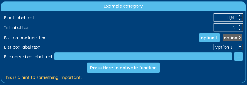
>>> option_buttons = ButtonBox(label="Button box label text",  # or self.translations.option_buttons if option_buttons is in Translation class
>>>                            default_index=0,
>>>                            entries=['option 1', 'option 2'],
>>>                            category=category_example)
Gives:

- add_link_2_show(option: Option | Category | FunctionButton | Hint, on_index: int)
This function couples the visibility of an option to the value of the ButtonBox object.
- Parameters
- optionOption, Category, FunctionButton, Hint
Option which visibility should be linked to the value of the FloatBox.
- on_indexint
The index on which the linked options should be made visible.
- Returns
- None
Examples
This function can be used to couple the ButtonBox value to other options, hints, function buttons or categories. In the example below, ‘option linked’ will be shown if the first (‘0’) option is selected in the ButtonBox.
>>> option_buttons.add_link_2_show(option=option_linked, on_index=0)
- check_linked_value(value: int, value_if_hidden: Optional[bool] = None) bool
This function checks if the linked “option” should be shown.
- Parameters
- valueint
index on which the option should be shown
- value_if_hidden: bool | None
the return value, if the option is hidden
- Returns
- bool
True if the linked “option” should be shown
- create_function_2_check_linked_value(value: int, value_if_hidden: bool | None = None) Callable[[], bool]
creates from values a function to check linked values
- Parameters
- valueint
index on which the option should be shown
- value_if_hidden: bool | None
the return value, if the option is hidden
- Returns
- function
- create_widget(frame: QFrame, layout_parent: QLayout, row: Optional[int] = None, column: Optional[int] = None) None
This functions creates the ButtonBox widget in the frame.
- Parameters
- frameQtW.QFrame
The frame object in which the widget should be created
- layout_parentQtW.QLayout
The parent layout of the current widget
- rowint
The index of the row in which the widget should be created (only needed when there is a grid layout)
- columnint
The index of the column in which the widget should be created (only needed when there is a grid layout)
- Returns
- None
- disable_entry(idx: int)
Disables the entry at index
- Parameters
- idx: int
index of entry which should be disabled
- enable_entry(idx: int)
Enables the entry at index
- Parameters
- idx: int
index of entry which should be disabled
- get_value() int
This function gets the value of the ButtonBox.
- Returns
- int
Value of the ButtonBox
This function returns a boolean value related to whether or not the option is hidden.
- Returns
- Bool
True if the option is hidden
- set_text(name: str) None
This function sets the text of the label and of the different buttons in the ButtonBox.
- Parameters
- name: str
String with the names of all the buttons (in order) and the label name at position 0. These strings are separated by “,”
- Returns
- None
- set_value(value: int) None
This function sets the value of the ButtonBox.
- Parameters
- valueint
Value to which the ButtonBox should be set.
- Returns
- None
- update_function(button: QPushButton, button_opponent: QPushButton, false_button_list: Optional[list[PySide6.QtWidgets.QPushButton]] = None) None
This function updates which button should be checked/activated or unchecked/deactivated This can be done by either the toggle behaviour or not-change behaviour.
- Parameters
- buttonQtW.QPushButton
Button which is activated (iff it was not already), and which is deactivated if it was active and is pressed on
- button_opponentQtW.QPushButton
Button which is activated if the current button was active and is pressed on
- false_button_listList[QtW.QPushButton] | None
List with other buttons which aren’t active
- Returns
- None
- class ScenarioGUI.gui_classes.gui_structure_classes.Category(label: str | list[str], page: Page)
Bases:
objectThis class contains all the information for categories - the place where options are put.
- Parameters
- labelstr | List[str]
Label of the category
- pagePage
Page on which the category should be placed
Examples
>>> category_example = Category(label="Example category",  # or self.translations.category_example if category_example is in Translation class
>>>                             page=page_example)
Gives:
- activate_graphic_left() None
This function activates the possibility to show a figure next to the options in the category. The figure is shown on the left side of the options.
- Returns
- None
Examples
>>> self.category_pipe_data.activate_graphic_left()
The code above makes sure that the plot of the pipe internals is on the left of the options within the catgory.
- activate_graphic_right() None
This function activates the possibility to show a figure next to the options in the category. The figure is shown on the right side of the options.
- Returns
- None
Examples
>>> self.category_pipe_data.activate_graphic_right()
The code above makes sure that the plot of the pipe internals is on the right of the options within the catgory.
- activate_grid_layout(column: int) None
This function activates the grid layout of the Category.
- Parameters
- columnint
Number of columns in the grid layout.
- Returns
- None
Examples
The code below is used to create a grid layout with 5 columns for the monthly thermal demands.
>>> self.category_th_demand.activate_grid_layout(5)
- create_graphic_view(layout: QLayout) QGraphicsView
This function creates a graphic view for the case a figure will be shown in the Category.
- Parameters
- layoutQtW.QLayout
The layout element where the graphic view should be created in
- Returns
- QtW.QGraphicsView
The box where the graphical element will be drawn into
- create_widget(page: QWidget, layout: QLayout)
This function creates the frame for this Category on a given page. If the current label text is “”, then the frame attribute is set to the given frame. It populates this category widget with all the options within this category.
- Parameters
- pageQtW.QWidget
Widget (i.e. page) in which this option should be created
- layoutQtW.QLayout
The layout parent of the current frame
- Returns
- None
- hide(**kwargs) None
This function makes the current category invisible and everything on them. It makes sure that it only hides the objects that were not already hidden due to some links with other options.
- Returns
- None
This function returns a boolean value related to whether or not the category is hidden.
- Returns
- Bool
True if the option is hidden
- set_font_size(size: int) None
set the new font size to button
- Parameters
- size: new font size in points
- Returns
- None
- set_text(name: str) None
This function sets the text in the Category label.
- Parameters
- namestr
Name of the Category
- Returns
- None
- show(**kwargs) None
This function makes the current category visible.
- Returns
- None
- translate(idx: int) None
Translates the label.
- Parameters
- idx: int
index of language
- Returns
- None
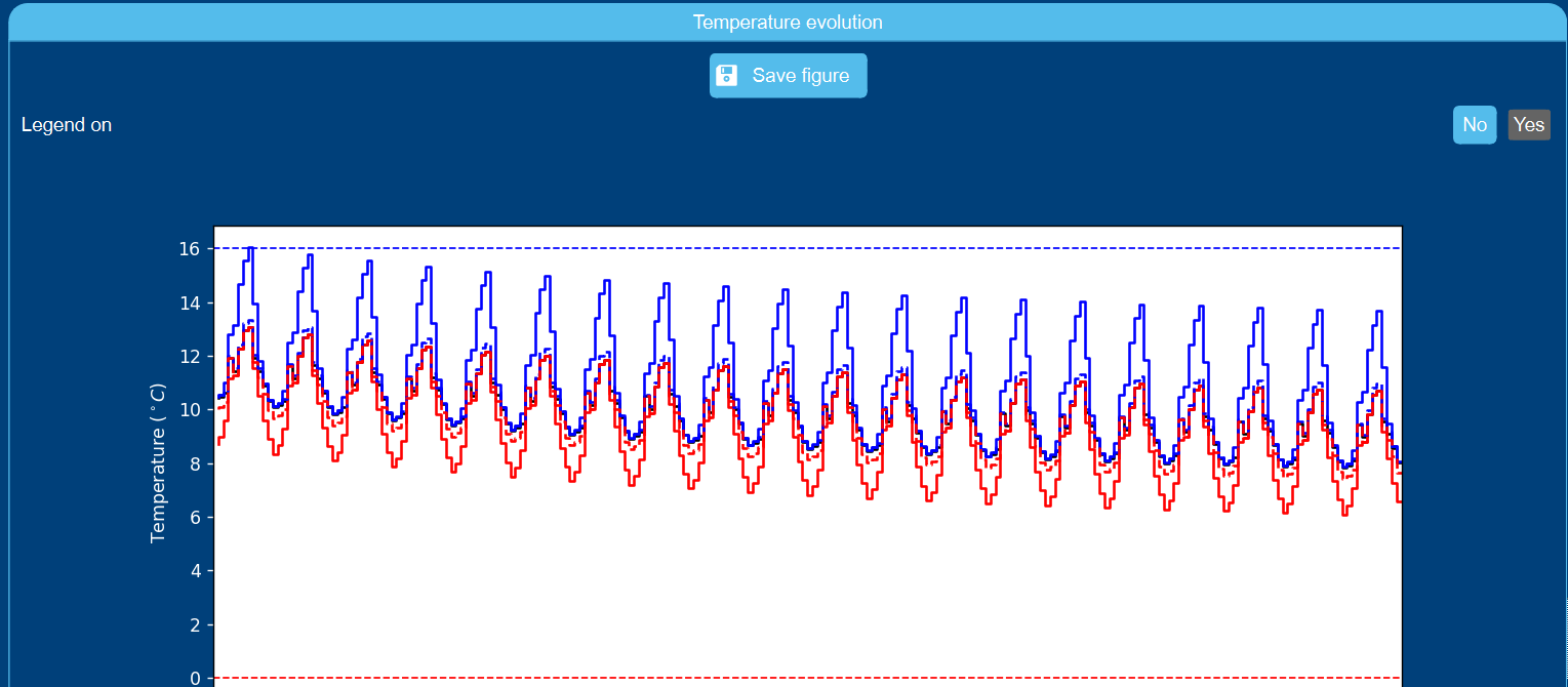
- class ScenarioGUI.gui_classes.gui_structure_classes.FigureOption(category: ResultFigure, label: str | list[str], param: str, default: int, *, entries: list[str] = None, entries_values: list = None)
Bases:
ButtonBoxThis class contains all the functionalities of the FigureOption. Such an element is not placed in itself on the GUI, but is part of the ResultFigure category. It can be used to add an extra option to alter the figure shown.
- Parameters
- categoryResultFigure
Category in which the FigureOption should be placed
- labelstr | list[str]
The labels of the FigureOption for different languages
- paramstr
Name of the argument in the function that is used to generate the figure
- defaultint
The default index of the FigureOption
- entriesList[str]
The list of all the different buttons in the FigureOption
- entries_valuesList
The list of all the corresponding values (w.r.t. entries) for the argument defined in param
Examples
The example below adds the legende on/off option to the temperature profile figure.
>>> self.option_figure = FigureOption(category=self.figure_temperature_profile,
>>>                                   label="Legend on?",  # or self.translations.option_figure if option_figure is in Translation class
>>>                                   param="legend",
>>>                                   default=0,
>>>                                   entries=[" No ", " Yes "],
>>>                                   entries_values=[False, True])
Gives:

- get_value() tuple[str, int]
This functions returns the value of the FigureOption. This is used to update the finale results figure.
- Returns
- key_name, key_valuestr, int
Name of the variable and its value as an argument for the function in the Borefield Class that creates the figure.
- set_value(values: tuple[str, int]) None
This function sets the value of the FigureOption.
- Parameters
- valuesTuple[str, int]
Tuple containing the value of the FigureOption and its selected index. Only the index is used.
- Returns
- None
- class ScenarioGUI.gui_classes.gui_structure_classes.FileNameBox(label: str | list[str], default_value: str, category: Category, *, dialog_text: str = '', error_text: str = '', file_extension: str | list[str] = 'csv')
Bases:
OptionThis class contains all the functionalities of the FileNameBox (filename input box) option in the GUI. The FileNameBox can be used to import a datafile.
- Parameters
- labelstr | list[str]
The labels of the FileNameBox for different languages
- default_valueint
The default value of the FileNameBox
- categoryCategory
Category in which the FileNameBox should be placed
- dialog_textstr
Text to be displayed in the top bar of the dialog box
- error_textstr
Error text to be shown in the status_bar
Examples
>>> option_file = FileNameBox(label="File name box label text",  # or self.translations.option_file if option_file is in Translation class
>>>                           default_value='example_file.XX',
>>>                           dialog_text='Choose *.XX file',
>>>                           error_text='no file found',
>>>                           file_extension="csv",
>>>                           category=category_example)
Gives:

- add_link_2_show(option: Option | Category | FunctionButton | Hint, value: str) None
This function couples the visibility of an option to the value of the FloatBox object.
- Parameters
- optionOption, Category, FunctionButton, Hint
Option which visibility should be linked to the value of the FloatBox.
- valuestr
string on which the option should be shown
- Returns
- None
Examples
This function can be used to couple the FloatBox value to other options, hints, function buttons or categories. In the example below, ‘option linked’ will be shown if the float value is below 0.1 or above 0.9.
>>> option.add_link_2_show(option=option_linked, value="")
- check_linked_value(value: str, value_if_hidden: Optional[bool] = None) bool
This function checks if the linked “option” should be shown.
- Parameters
- valuestr
string on which the option should be shown
- value_if_hidden: bool | None
the return value, if the option is hidden
- Returns
- bool
True if the linked “option” should be shown
- create_function_2_check_linked_value(value: str, value_if_hidden: bool | None = None) Callable[[], bool]
creates from values a function to check linked values
- Parameters
- valuestr
string on which the option should be shown
- value_if_hidden: bool | None
the return value, if the option is hidden
- Returns
- function
- create_widget(frame: QFrame, layout_parent: QLayout, row: Optional[int] = None, column: Optional[int] = None) None
This functions creates the ButtonBox widget in the frame.
- Parameters
- frameQtW.QFrame
The frame object in which the widget should be created
- layout_parentQtW.QLayout
The parent layout of the current widget
- rowint | None
The index of the row in which the widget should be created (only needed when there is a grid layout)
- columnint | None
The index of the column in which the widget should be created (only needed when there is a grid layout)
- Returns
- None
- fun_choose_file() None
This function opens a file selector, with which the filename path can be selected. This is automatically added to the FileNameBox.
- Returns
- None
- get_value() str
This function returns the filename (with path) which is put into the FileNameBox.
- Returns
- str
Filename (with path)
- set_font_size(size: int) None
set the new font size to label, text box and button
- Parameters
- size: new font size in points
- Returns
- None
- set_value(value: str) None
This function sets the value of the FileNameBox.
- Parameters
- valueint
Value to which the FileNameBox should be set.
- Returns
- None
- class ScenarioGUI.gui_classes.gui_structure_classes.FlexibleAmount(label: str | Collection[str], default_length: int, entry_mame: str, category: Category, *, min_length: int = 1, max_length: int = 1000, default_values: Collection[Collection[int | float | str | bool]] | None = None)
Bases:
OptionThis class contains all the functionalities of the FloatBox option in the GUI. The FloatBox can be used to input floating point numbers.
- Parameters
- labelstr | Iterable[str]
The label of the Option
- default_lengthint
how many entries should exists per default?
- entry_mame: str
name of the entries
- categoryCategory
Category in which the FloatBox should be placed
- min_length: int | None
minimal option length
- max_length: int | None
maximal option length
- default_values: Iterable[Iterable[int | float | bool | str]]
default values
Examples
>>> option_flex = FlexibleAmount(label='flexible option',  # or self.translations.option_flex if option_flex is in Translation class
>>>                              default_length=2,
>>>                              category=category_example,
>>>                              entry_mame="layer")
Gives:

- add_link_2_show(option: Option | Category | FunctionButton | Hint, min_length: int | None = None, max_length: int | None = None) None
This function couples the visibility of an option to the value of the FloatBox object.
- Parameters
- optionOption, Category, FunctionButton, Hint
Option which visibility should be linked to the value of the FloatBox.
- min_lengthint | None
length of the Options below which the linked option will be hidden
- max_lengthint | None
length of the Options above which the linked option will be hidden
- Returns
- None
Examples
This function can be used to couple the FloatBox value to other options, hints, function buttons or categories. In the example below, ‘option linked’ will be shown if the float value is below 0.1 or above 0.9.
>>> option_flex.add_link_2_show(option=option_linked, min_length=2, max_length=10)
- check_linked_value(value: tuple[int | None, int | None], value_if_hidden: Optional[bool] = None) bool
This function checks if the linked “option” should be shown.
- Parameters
- valuetuple of 2 optional ints
first value minimal length and second maximal length
- value_if_hidden: bool | None
the return value, if the option is hidden
- Returns
- bool
True if the linked “option” should be shown
- create_function_2_check_linked_value(value: tuple[int | None, int | None], value_if_hidden: bool | None = None) Callable[[], bool]
creates from values a function to check linked values
- Parameters
- valuetuple of 2 optional ints
first value minimal length and second maximal length
- value_if_hidden: bool | None
the return value, if the option is hidden
- Returns
- function
- create_widget(frame: QFrame, layout_parent: QLayout, *, row: Optional[int] = None, column: Optional[int] = None) None
This functions creates the FloatBox widget in the frame.
- Parameters
- frameQtW.QFrame
The frame object in which the widget should be created
- layout_parentQtW.QLayout
The parent layout of the current widget
- rowint | None
The index of the row in which the widget should be created (only needed when there is a grid layout)
- columnint | None
The index of the column in which the widget should be created (only needed when there is a grid layout)
- Returns
- None
- get_value() tuple[tuple[str | float | int | bool]]
This function gets the value of the FloatBox.
- Returns
- list of values
Values of the FlexibleAmount
- hide() None
This function makes the current frame invisible.
- Returns
- None
- init_links() None
Function on how the links for the FloatBox should be set.
- Returns
- None
- set_font_size(size: int) None
set the new font size to button
- Parameters
- size: new font size in points
- Returns
- None
- set_text(name: str) None
This function sets the label text.
- Parameters
- namestr
Label name of the object
- Returns
- None
- set_value(value: Collection[Collection[str | float | int | bool]]) None
This function sets the value of the Flexible Amount option.
- Parameters
- valuelist of list of float, int, str, bool
Value to which the option should be set.
- Returns
- None
- show() None
This function makes the current frame visible.
- Returns
- None
- show_option(option: Option | Category | FunctionButton | Hint, min_length: int | None, max_length: int | None, args=None)
This function shows the option if the value of the FloatBox is between the below and above value. If no below or above values are given, no boundary is taken into account for respectively the lower and upper boundary.
- Parameters
- optionOption, Category, FunctionButton, Hint
Option to be shown or hidden
- min_lengthint (optional)
value length of the Option below which the linked option will be hidden
- max_lengthint (optional)
value length of the Option above which the linked option will be hidden
- Returns
- None
- class ScenarioGUI.gui_classes.gui_structure_classes.FloatBox(label: str | list[str], default_value: float, category: Category, *, decimal_number: int = 0, minimal_value: float = 0.0, maximal_value: float = 100.0, step: float = 1.0)
Bases:
OptionThis class contains all the functionalities of the FloatBox option in the GUI. The FloatBox can be used to input floating point numbers.
- Parameters
- labelstr | List[str]
The label of the FloatBox
- default_valuefloat
The default value of the FloatBox
- categoryCategory
Category in which the FloatBox should be placed
- decimal_numberint
Number of decimal points in the FloatBox
- minimal_valuefloat
Minimal value of the FloatBox
- maximal_valuefloat
Maximal value of the FloatBox
- stepfloat
The step by which the value of the FloatBox should change when the increase or decrease buttons are pressed.
Examples
>>> option_float = FloatBox(label="Float label text",  # or self.translations.option_float if option_float is in Translation class
>>>                         default_value=0.5,
>>>                         category=category_example,
>>>                         decimal_number=2,
>>>                         minimal_value=0,
>>>                         maximal_value=1,
>>>                         step=0.1)
Gives:

- add_link_2_show(option: Option | Category | FunctionButton | Hint, below: float = None, above: float = None) None
This function couples the visibility of an option to the value of the FloatBox object.
- Parameters
- optionOption, Category, FunctionButton, Hint
Option which visibility should be linked to the value of the FloatBox.
- belowfloat
Lower threshold of the FloatBox value below which the linked option will be hidden
- abovefloat
Higher threshold of the FloatBox value above which the linked option will be hidden
- Returns
- None
Examples
This function can be used to couple the FloatBox value to other options, hints, function buttons or categories. In the example below, ‘option linked’ will be shown if the float value is below 0.1 or above 0.9.
>>> option_float.add_link_2_show(option=option_linked, below=0.1, above=0.9)
- check_linked_value(value: tuple[float | None, float | None], value_if_hidden: Optional[bool] = None) bool
This function checks if the linked “option” should be shown.
- Parameters
- valuetuple of 2 optional floats
first one is the below value and the second the above value
- value_if_hidden: bool | None
the return value, if the option is hidden
- Returns
- bool
True if the linked “option” should be shown
- create_function_2_check_linked_value(value: tuple[float | None, float | None], value_if_hidden: bool | None = None) Callable[[], bool]
creates from values a function to check linked values
- Parameters
- valuetuple of 2 optional floats
first one is the below value and the second the above value
- value_if_hidden: bool | None
the return value, if the option is hidden
- Returns
- function
- create_widget(frame: QFrame, layout_parent: QLayout, *, row: Optional[int] = None, column: Optional[int] = None) None
This functions creates the FloatBox widget in the frame.
- Parameters
- frameQtW.QFrame
The frame object in which the widget should be created
- layout_parentQtW.QLayout
The parent layout of the current widget
- rowint | None
The index of the row in which the widget should be created (only needed when there is a grid layout)
- columnint | None
The index of the column in which the widget should be created (only needed when there is a grid layout)
- Returns
- None
- get_value() float
This function gets the value of the FloatBox.
- Returns
- float
Value of the FloatBox
- set_value(value: float) None
This function sets the value of the FloatBox.
- Parameters
- valuefloat
Value to which the FloatBox should be set.
- Returns
- None
- show_option(option: Option | Category | FunctionButton | Hint, below: float | None, above: float | None, args=None)
This function shows the option if the value of the FloatBox is between the below and above value. If no below or above values are given, no boundary is taken into account for respectively the lower and upper boundary.
- Parameters
- optionOption, Category, FunctionButton, Hint
Option to be shown or hidden
- belowfloat (optional)
Lower threshold of the FloatBox value below which the linked option will be hidden
- abovefloat (optional)
Higher threshold of the FloatBox value above which the linked option will be hidden
- Returns
- None
- class ScenarioGUI.gui_classes.gui_structure_classes.FloatBoxWithUnits(label: str | list[str], default_value: float, category: Category, *, decimal_number: int = 0, minimal_value: float = 0.0, maximal_value: float = 100.0, step: float = 1.0, units: list[tuple[str, float]] | None = None)
Bases:
FloatBoxInt box with units as Combobox
- Parameters
- labelstr | List[str]
The label of the FloatBox
- default_valuefloat
The default value of the FloatBox
- categoryCategory
Category in which the FloatBox should be placed
- decimal_numberint
Number of decimal points in the FloatBox
- minimal_valuefloat
Minimal value of the FloatBox
- maximal_valuefloat
Maximal value of the FloatBox
- stepfloat
The step by which the value of the FloatBox should change when the increase or decrease buttons are pressed.
- units: list[tuple[str, float]]
The list of units with its names and thier scaling factors
Examples
>>> option_float = FloatBoxWithUnits(label="Float label text",  # or self.translations.option_float if option_float is in Translation class
>>>                         default_value=0.5,
>>>                         category=category_example,
>>>                         decimal_number=2,
>>>                         minimal_value=0,
>>>                         maximal_value=1,
>>>                         step=0.1,
>>>                         units=[("kW", 1), ("W", 0.001), ("MW", 1_000)])
Gives:

- activate_scale_decimals() None
activates that the decimal number is scaled with the units in the drop down menu
- Returns
- None
- check_linked_value(value: tuple[float | None, float | None], value_if_hidden: Optional[bool] = None) bool
This function checks if the linked “option” should be shown.
- Parameters
- valuetuple of 2 optional floats
first one is the below value and the second the above value
- value_if_hidden: bool | None
the return value, if the option is hidden
- Returns
- bool
True if the linked “option” should be shown
- create_function_2_check_linked_value(value: tuple[float | None, float | None], value_if_hidden: bool | None = None) Callable[[], bool]
creates from values a function to check linked values
- Parameters
- valuetuple of 2 optional floats
first one is the below value and the second the above value
- value_if_hidden: bool | None
the return value, if the option is hidden
- Returns
- function
- create_widget(frame: QFrame, layout_parent: QLayout, *, row: Optional[int] = None, column: Optional[int] = None) None
This functions creates the IntBox widget in the frame.
- Parameters
- frameQtW.QFrame
The frame object in which the widget should be created
- layout_parentQtW.QLayout
The parent layout of the current widget
- rowint | None
The index of the row in which the widget should be created (only needed when there is a grid layout)
- columnint | None
The index of the column in which the widget should be created (only needed when there is a grid layout)
- Returns
- None
- get_value() tuple[float, int]
This function gets the value of the IntBox.
- Returns
- tuple[float, int]
Value of the IntBox multiplied with units value and unit box index
- set_font_size(size: int) None
scale the font size
- Parameters
- size: int
new font size
- set_value(value: tuple[float | int, int] | float | int) None
This function sets the value of the IntBox.
- Parameters
- valuetuple[float, int]
Value to which the IntBox should be set and unit widget index
- Returns
- None
- show_option(option: Option | Category | FunctionButton | Hint, below: float | None, above: float | None, args=None)
This function shows the option if the value of the FloatBox is between the below and above value. If no below or above values are given, no boundary is taken into account for respectively the lower and upper boundary.
- Parameters
- optionOption, Category, FunctionButton, Hint
Option to be shown or hidden
- belowfloat (optional)
Lower threshold of the FloatBox value below which the linked option will be hidden
- abovefloat (optional)
Higher threshold of the FloatBox value above which the linked option will be hidden
- Returns
- None
- class ScenarioGUI.gui_classes.gui_structure_classes.FontListBox(label: str | list[str], default_index: int, entries: list[str], category: Category)
Bases:
ListBoxThis class contains all the functionalities of the ListBox option in the GUI. The ListBox can be used to select one option out of many (sort of like the ButtonBox)
- Parameters
- labelList[str]
The label of the ListBox
- default_indexint
The default index of the ListBox
- entriesList[str]
The list of all the different buttons in the ListBox
- categoryCategory
Category in which the ButtonBox should be placed
Examples
>>> option_list = ListBox(label="List box label text",  # or self.translations.hint_example if hint_example is in Translation class
>>>                       default_index=0,
>>>                       entries=['Arial', 'Verdana'],
>>>                       category=category_example)
Gives:

- create_widget(frame: QFrame, layout_parent: QLayout, row: Optional[int] = None, column: Optional[int] = None) None
This functions creates the ListBox widget in the frame.
- Parameters
- frameQtW.QFrame
The frame object in which the widget should be created
- layout_parentQtW.QLayout
The parent layout of the current widget
- rowint | None
The index of the row in which the widget should be created (only needed when there is a grid layout)
- columnint | None
The index of the column in which the widget should be created (only needed when there is a grid layout)
- Returns
- None
- class ScenarioGUI.gui_classes.gui_structure_classes.FunctionButton(button_text: str | list[str], icon: str, category: Category)
Bases:
objectThis class contains all the functionalities of the FunctionButton option in the GUI. The FunctionButton can be used to couple a button press to a function call.
- Parameters
- button_textlist[str]
The label of the FunctionButton
- iconstr
Location of the icon for the FunctionButton
- categoryCategory
Category in which the FunctionButton should be placed
Examples
>>> function_example = FunctionButton(button_text="Press Here to activate function",
>>> # or self.translations.function_example if function_example is in Translation class
>>>                                   icon=":/icons/icons/example_icon.svg",
>>>                                   category=category_example)
Gives:

- change_event(function_to_be_called: Callable, *args) None
This function calls the function_to_be_called whenever the FunctionButton is pressed.
- Parameters
- function_to_be_calledcallable
Function which should be called
- args
Arguments to be passed through to the function_to_be_called
- Returns
- None
- create_widget(frame: QFrame, layout_parent: QLayout)
This functions creates the FunctionButton in the frame.
- Parameters
- frameQtW.QFrame
The frame object in which the widget should be created
- layout_parentQtW.QLayout
The parent layout of the current widget
- Returns
- None
- hide() None
This function makes the FunctionButton invisible.
- Returns
- None
This function returns a boolean value related to whether or not the FunctionButton is hidden.
- Returns
- Bool
True if the option is hidden
- set_font_size(size: int) None
set the text size of hint
- Parameters
- size: int
new font size as points
- Returns
- ——-
- set_text(name: str)
This function sets the text of the FunctionButton.
- Parameters
- namestr
Text of the FunctionButton
- Returns
- None
- show() None
This function makes the current FunctionButton visible.
- Returns
- None
- translate(idx: int) None
Translates the label.
- Parameters
- idx: int
index of language
- Returns
- None
- class ScenarioGUI.gui_classes.gui_structure_classes.Hint(hint: str | list[str], category: Category, warning: bool = False)
Bases:
objectThis class contains all the functionalities of the Hint option in the GUI. Hints can be used to show text (for information or warnings) inside the category.
- Parameters
- hintList[str]
Text of the hint
- categoryCategory
Category in which the Hint should be placed
- warningbool
True if the Hint should be shown
Examples
>>> hint_example = Hint(hint="This is a hint to something important.",  # or self.translations.hint_example if hint_example is in Translation class
>>>                     category=category_example,
>>>                     warning=True)
Gives:

- create_widget(frame: QFrame, layout_parent: QLayout, row: Optional[int] = None, column: Optional[int] = None) None
This functions creates the ButtonBox widget in the frame.
- Parameters
- frameQtW.QFrame
The frame object in which the widget should be created
- layout_parentQtW.QLayout
The parent layout of the current widget
- rowint
The index of the row in which the widget should be created (only needed when there is a grid layout)
- columnint
The index of the column in which the widget should be created (only needed when there is a grid layout)
- Returns
- None
- hide() None
This function makes the Hint invisible.
- Returns
- None
This function returns a boolean value related to whether or not the Hint is hidden.
- Returns
- Bool
True if the option is hidden
- set_font_size(size: int) None
set the text size of hint
- Parameters
- size: int
new font size as points
- Returns
- ——-
- set_text(name: str)
This function sets the text of the Hint.
- Parameters
- namestr
Text of the Hint
- Returns
- None
- show() None
This function makes the current Hint visible.
- Returns
- None
- translate(idx: int) None
Translates the label.
- Parameters
- idx: int
index of language
- Returns
- None
- class ScenarioGUI.gui_classes.gui_structure_classes.IntBox(label: str | list[str], default_value: int, category: Category, *, minimal_value: int = 0, maximal_value: int = 100, step: int = 1)
Bases:
OptionThis class contains all the functionalities of the IntBox (integer box) option in the GUI. The IntBox can be used to input integer numbers.
- Parameters
- labelstr | List[str]
The label of the IntBox
- default_valueint
The default value of the IntBox
- categoryCategory
Category in which the IntBox should be placed
- minimal_valueint
Minimal value of the IntBox
- maximal_valueint
Maximal value of the IntBox
- stepint
The step by which the value of the IntBox should change when the increase or decrease buttons are pressed.
Examples
>>> option_int = IntBox(label="Int label text",  # or self.translations.hint_example if hint_example is in Translation class
>>>                     default_value=2,
>>>                     category=category_example,
>>>                     minimal_value=0,
>>>                     maximal_value=12,
>>>                     step=2)
Gives:

- add_link_2_show(option: Option | Category | FunctionButton | Hint, *, below: int | None = None, above: int | None = None)
This function couples the visibility of an option to the value of the IntBox object.
- Parameters
- optionOption, Category, FunctionButton, Hint
Option which visibility should be linked to the value of the IntBox.
- belowint | None
Lower threshold of the FloatBox value below which the linked option will be hidden
- aboveint | None
Higher threshold of the FloatBox value above which the linked option will be hidden
- Returns
- None
Examples
This function can be used to couple the IntBox value to other options, hints, function buttons or categories. So in the example option_linked will be shown if the integer value is below 1 or above 10.
>>> option_int.add_link_2_show(option=option_linked, below=1, above=10)
- check_linked_value(value: tuple[int | None, int | None], value_if_hidden: Optional[bool] = None) bool
This function checks if the linked “option” should be shown.
- Parameters
- valuetuple of 2 optional ints
first one is the below value and the second the above value
- value_if_hidden: bool | None
the return value, if the option is hidden
- Returns
- bool
True if the linked “option” should be shown
- create_function_2_check_linked_value(value: tuple[int | None, int | None], value_if_hidden: bool | None = None) Callable[[], bool]
creates from values a function to check linked values
- Parameters
- valuetuple of 2 optional ints
first one is the below value and the second the above value
- value_if_hidden: bool | None
the return value, if the option is hidden
- Returns
- function
- create_widget(frame: QFrame, layout_parent: QLayout, *, row: Optional[int] = None, column: Optional[int] = None) None
This functions creates the IntBox widget in the frame.
- Parameters
- frameQtW.QFrame
The frame object in which the widget should be created
- layout_parentQtW.QLayout
The parent layout of the current widget
- rowint | None
The index of the row in which the widget should be created (only needed when there is a grid layout)
- columnint | None
The index of the column in which the widget should be created (only needed when there is a grid layout)
- Returns
- None
- get_value() int
This function gets the value of the IntBox.
- Returns
- int
Value of the IntBox
- set_value(value: int) None
This function sets the value of the IntBox.
- Parameters
- valueint
Value to which the IntBox should be set.
- Returns
- None
- show_option(option: Option | Category | FunctionButton | Hint, below: int | None, above: int | None, args=None)
This function shows the option if the value of the IntBox is between the below and above value. If no below or above values are given, no boundary is taken into account for respectively the lower and upper boundary.
- Parameters
- optionOption, Category, FunctionButton, Hint
Option to be shown or hidden
- belowint (optional)
Lower threshold of the IntBox value below which the linked option will be hidden
- aboveint (optional)
Higher threshold of the IntBox value above which the linked option will be hidden
- Returns
- None
- class ScenarioGUI.gui_classes.gui_structure_classes.IntBoxWithUnits(label: str | list[str], default_value: int, category: Category, *, minimal_value: int = 0, maximal_value: int = 100, step: int = 1, units: list[tuple[str, float]] | None = None)
Bases:
IntBoxInt box with units as Combobox
- Parameters
- labelstr | List[str]
The label of the IntBox
- default_valueint
The default value of the IntBox
- categoryCategory
Category in which the IntBox should be placed
- minimal_valueint
Minimal value of the IntBox
- maximal_valueint
Maximal value of the IntBox
- stepint
The step by which the value of the IntBox should change when the increase or decrease buttons are pressed.
- units: list[tuple[str, float]]
The list of units with its names and thier scaling factors
Examples
>>> option_int = IntBoxWithUnits(label="Int label text",  # or self.translations.hint_example if hint_example is in Translation class
>>>                     default_value=2,
>>>                     category=category_example,
>>>                     minimal_value=0,
>>>                     maximal_value=12,
>>>                     step=2,
>>>                     units=[("kW", 1), ("W", 0.001), ("MW", 1_000)])
Gives:

- check_linked_value(value: tuple[int | None, int | None], value_if_hidden: Optional[bool] = None) bool
This function checks if the linked “option” should be shown.
- Parameters
- valuetuple of 2 optional ints
first one is the below value and the second the above value
- value_if_hidden: bool | None
the return value, if the option is hidden
- Returns
- bool
True if the linked “option” should be shown
- create_function_2_check_linked_value(value: tuple[float | None, float | None], value_if_hidden: bool | None = None) Callable[[], bool]
creates from values a function to check linked values
- Parameters
- valuetuple of 2 optional ints
first one is the below value and the second the above value
- value_if_hidden: bool | None
the return value, if the option is hidden
- Returns
- function
- create_widget(frame: QFrame, layout_parent: QLayout, *, row: Optional[int] = None, column: Optional[int] = None) None
This functions creates the IntBox widget in the frame.
- Parameters
- frameQtW.QFrame
The frame object in which the widget should be created
- layout_parentQtW.QLayout
The parent layout of the current widget
- rowint | None
The index of the row in which the widget should be created (only needed when there is a grid layout)
- columnint | None
The index of the column in which the widget should be created (only needed when there is a grid layout)
- Returns
- None
- get_value() tuple[float, int]
This function gets the value of the IntBox.
- Returns
- tuple[float, int]
Value of the IntBox multiplied with units value and unit box index
- set_font_size(size: int) None
scale the font size
- Parameters
- size: int
new font size
- set_value(value: tuple[float | int, int] | float | int) None
This function sets the value of the IntBox.
- Parameters
- valuetuple[float, int]
Value to which the IntBox should be set and unit widget index
- Returns
- None
- show_option(option: Option | Category | FunctionButton | Hint, below: int | None, above: int | None, args=None)
This function shows the option if the value of the IntBox is between the below and above value. If no below or above values are given, no boundary is taken into account for respectively the lower and upper boundary.
- Parameters
- optionOption, Category, FunctionButton, Hint
Option to be shown or hidden
- belowfloat (optional)
Lower threshold of the IntBox value below which the linked option will be hidden
- abovefloat (optional)
Higher threshold of the IntBox value above which the linked option will be hidden
- Returns
- None
- class ScenarioGUI.gui_classes.gui_structure_classes.ListBox(label: str | list[str], default_index: int, entries: list[str], category: Category)
Bases:
OptionThis class contains all the functionalities of the ListBox option in the GUI. The ListBox can be used to select one option out of many (sort of like the ButtonBox)
- Parameters
- labelList[str]
The label of the ListBox
- default_indexint
The default index of the ListBox
- entriesList[str]
The list of all the different buttons in the ListBox
- categoryCategory
Category in which the ButtonBox should be placed
Examples
>>> option_list = ListBox(label="List box label text",  # or self.translations.hint_example if hint_example is in Translation class
>>>                       default_index=0,
>>>                       entries=['Option 1', 'Option 2'],
>>>                       category=category_example)
Gives:

- add_link_2_show(option: Option | Category | FunctionButton | Hint, *, on_index: int)
This function couples the visibility of an option to the value of the ButtonBox object.
- Parameters
- optionOption, Category, FunctionButton, Hint
Option which visibility should be linked to the value of the FloatBox.
- on_indexint
The index on which the linked options should be made visible.
- Returns
- None
Examples
This function can be used to couple the ButtonBox value to other options, hints, function buttons or categories. In the example below, ‘option linked’ will be shown if the first (‘0’) option is selected in the ListBox.
>>> option_list.add_link_2_show(option=option_linked, on_index=0)
- check_linked_value(value: int, value_if_hidden: Optional[bool] = None) bool
This function checks if the linked “option” should be shown.
- Parameters
- valueint
index on which the option should be shown
- value_if_hidden: bool | None
the return value, if the option is hidden
- Returns
- bool
True if the linked “option” should be shown
- create_function_2_check_linked_value(value: int, value_if_hidden: bool | None = None) Callable[[], bool]
creates from values a function to check linked values
- Parameters
- valueint
int of index on which the option should be shown
- value_if_hidden: bool | None
the return value, if the option is hidden
- Returns
- function
- create_widget(frame: QFrame, layout_parent: QLayout, row: Optional[int] = None, column: Optional[int] = None) None
This functions creates the ListBox widget in the frame.
- Parameters
- frameQtW.QFrame
The frame object in which the widget should be created
- layout_parentQtW.QLayout
The parent layout of the current widget
- rowint | None
The index of the row in which the widget should be created (only needed when there is a grid layout)
- columnint | None
The index of the column in which the widget should be created (only needed when there is a grid layout)
- Returns
- None
- get_text() str
This function returns the current text of the ListBox.
- Returns
- str
Current text on the ListBox
- get_value() tuple[int, str]
This function gets the value (i.e. index) of the ListBox.
- Returns
- int
Value/index of the ListBox
- set_text(name: str)
This function sets the text of the label and of the different buttons in the ListBox.
- Parameters
- name: str
String with the names of all the buttons (in order) and the label name at position 0. These strings are separated by “,”
- Returns
- None
- set_value(value: tuple[int, str] | int) None
This function sets the value/index of the ListBox.
- Parameters
- valueint
Index of the ListBox
- Returns
- None
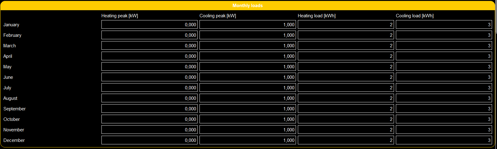
- class ScenarioGUI.gui_classes.gui_structure_classes.MatrixBox(label: str | list[str], default_value: float | list[list[float]], category: Category, *, column: int = 2, row: int = 2, decimal_number: int | list[list[int]] = 0, minimal_value: float | list[list[float]] = 0.0, maximal_value: float | list[list[float]] = 1000000000.0)
Bases:
OptionThis class contains all the functionalities of the MatrixBox option in the GUI. The MatrixBox can be used to input floating point numbers in a matrix format.
- Parameters
- labelstr | List[str]
The labels of the MatrixBox (first the columns sepereated by , and then the row names)
- default_valuefloat| list[list[float]]
The default values of the FloatBoxes
- categoryCategory
Category in which the MatrixBox should be placed
- decimal_numberint| list[list[int]]
Number of decimal points in the FloatBoxes
- minimal_valuefloat| list[list[float]]
Minimal values of the FloatBoxes
- maximal_valuefloat| list[list[float]]
Maximal values of the FloatBoxes
Examples
>>> option_mat = (label=["Heating peak [kW],Cooling peak [kW],Heating load [kWh],Cooling load [kWh],January,February,March,April,May,June,July,August,September,October,November,December"],
>>>                            default_value=[[0,1,2,3], [0,1,2,3],[0,1,2,3],[0,1,2,3],[0,1,2,3],[0,1,2,3],[0,1,2,3],[0,1,2,3],[0,1,2,3],[0,1,2,3],[0,1,
>>>                                                                                                                                                 2,3],[0,1,2,3]],
>>>                            category=self.category_monthly,
>>>                          row=12,
>>>                            column=4,
>>>                            minimal_value=0,
>>>                            decimal_number=[[3,3,0,0], [3,3,0,0], [3,3,0,0], [3,3,0,0], [3,3,0,0], [3,3,0,0], [3,3,0,0], [3,3,0,0], [3,3,0,0], [3,3,0,0], [3,3,0,0], [3,3,0,0]])
Gives:
- add_link_2_show(option: Option | Category | FunctionButton | Hint, below: list[list[float]] = None, above: list[list[float]] = None) None
This function couples the visibility of an option to the value of the FloatBox object.
- Parameters
- optionOption, Category, FunctionButton, Hint
Option which visibility should be linked to the value of the FloatBox.
- belowlist[list[float]] (optional)
Lower threshold of the FloatBox value below which the linked option will be hidden
- abovelist[list[float]] (optional)
Higher threshold of the FloatBox value above which the linked option will be hidden
- Returns
- None
Examples
This function can be used to couple the FloatBox value to other options, hints, function buttons or categories. In the example below, ‘option linked’ will be shown if the float value is below 0.1 or above 0.9.
>>> option_float.add_link_2_show(option=option_linked, below=0.1, above=0.9)
- check_linked_value(value: tuple[list[list[float]] | None, list[list[float]] | None], value_if_hidden: Optional[bool] = None) bool
This function checks if the linked “option” should be shown.
- Parameters
- valuetuple of 2 optional float lists
first one is the below values and the second the above values
- value_if_hidden: bool | None
the return value, if the option is hidden
- Returns
- bool
True if the linked “option” should be shown
- create_function_2_check_linked_value(value: tuple[list[list[float]] | None, list[list[float]] | None], value_if_hidden: bool | None = None) Callable[[], bool]
creates from values a function to check linked values
- Parameters
- value: tuple[list[list[float]] | None, list[list[float]] | None]
first one is the below values and the second the above values
- value_if_hidden: bool | None
the return value, if the option is hidden
- Returns
- ——-
- function
- create_widget(frame: QFrame, layout_parent: QLayout, *, row: Optional[int] = None, column: Optional[int] = None) None
This functions creates the FloatBox widget in the frame.
- Parameters
- frameQtW.QFrame
The frame object in which the widget should be created
- layout_parentQtW.QLayout
The parent layout of the current widget
- rowint
The index of the row in which the widget should be created (only needed when there is a grid layout)
- columnint
The index of the column in which the widget should be created (only needed when there is a grid layout)
- Returns
- None
- get_value() list[list[float]]
This function gets the value of the FloatBox.
- Returns
- float
Value of the FloatBox
- set_text(name: str) None
This function sets the label text.
- Parameters
- namestr
Label name of the object
- Returns
- None
- set_value(value: list[list[float]]) None
This function sets the value of the FloatBox.
- Parameters
- valuefloat
Value to which the FloatBox should be set.
- Returns
- None
- show_option(option: Option | Category | FunctionButton | Hint, below: list[list[float]] | None, above: list[list[float]] | None, args=None)
This function shows the option if the value of the FloatBox is between the below and above value. If no below or above values are given, no boundary is taken into account for respectively the lower and upper boundary.
- Parameters
- optionOption, Category, FunctionButton, Hint
Option to be shown or hidden
- belowlist[list[float]] (optional)
Lower threshold of the FloatBox value below which the linked option will be hidden
- abovelist[list[float]] (optional)
Higher threshold of the FloatBox value above which the linked option will be hidden
- Returns
- None
- class ScenarioGUI.gui_classes.gui_structure_classes.MultipleIntBox(label: str | list[str], default_value: Iterable[int], category: Category, *, minimal_value: Iterable[int] | int = 0, maximal_value: Iterable[int] | int = 100, step: Iterable[int] | int = 1)
Bases:
OptionThis class contains all the functionalities of the IntBox (integer box) option in the GUI. The IntBox can be used to input integer numbers.
- Parameters
- labelstr | List[str]
The label of the IntBox
- default_valueIterable[int]
The default value of the IntBox
- categoryCategory
Category in which the IntBox should be placed
- minimal_valueIterable[int] | int
Minimal value of the IntBox
- maximal_valueIterable[int] | int
Maximal value of the IntBox
- stepIterable[int] | int
The step by which the value of the IntBox should change when the increase or decrease buttons are pressed.
Examples
>>> option_int = MultipleIntBox(label="Int label text",  # or self.translations.option_int if option_int is in Translation class
>>>                             default_value=(1,2,3),
>>>                             category=category_example,
>>>                             minimal_value=0,
>>>                             maximal_value=(12,11,10),
>>>                             step=2)
Gives:

- add_link_2_show(option: Option | Category | FunctionButton | Hint, *, below: Iterable[int] | None = None, above: Iterable[int] | None = None)
This function couples the visibility of an option to the value of the IntBox object.
- Parameters
- optionOption, Category, FunctionButton, Hint
Option which visibility should be linked to the value of the IntBox.
- belowIterable[int]
Lower threshold of the FloatBox value below which the linked option will be hidden
- aboveIterable[int]
Higher threshold of the FloatBox value above which the linked option will be hidden
- Returns
- None
Examples
This function can be used to couple the IntBox value to other options, hints, function buttons or categories. So in the example option_linked will be shown if the integer value is below 1 or above 10.
>>> option_int.add_link_2_show(option=option_linked, below=1, above=10)
- check_linked_value(value: tuple[collections.abc.Iterable[int] | None, collections.abc.Iterable[int] | None], value_if_hidden: Optional[bool] = None) bool
This function checks if the linked “option” should be shown.
- Parameters
- valueIterable of ints
first one is the below value and the second the above value
- value_if_hidden: bool | None
the return value, if the option is hidden
- Returns
- bool
True if the linked “option” should be shown
- create_function_2_check_linked_value(value: tuple[Iterable[int] | None, Iterable[int] | None], value_if_hidden: bool | None = None) Callable[[], bool]
creates from values a function to check linked values
- Parameters
- valueIterable of ints
first one is the below value and the second the above value
- value_if_hidden: bool | None
the return value, if the option is hidden
- Returns
- function
- create_widget(frame: QFrame, layout_parent: QLayout, *, row: Optional[int] = None, column: Optional[int] = None) None
This functions creates the IntBox widget in the frame.
- Parameters
- frameQtW.QFrame
The frame object in which the widget should be created
- layout_parentQtW.QLayout
The parent layout of the current widget
- rowint | None
The index of the row in which the widget should be created (only needed when there is a grid layout)
- columnint | None
The index of the column in which the widget should be created (only needed when there is a grid layout)
- Returns
- None
- get_value() tuple[int]
This function gets the value of the IntBox.
- Returns
- tuple[int]
Value of the IntBox
- set_value(value: list[int] | tuple[int]) None
This function sets the value of the IntBox.
- Parameters
- valuelist[int]
Value to which the IntBox should be set.
- Returns
- None
- show_option(option: Option | Category | FunctionButton | Hint, below: Iterable[int] | None, above: Iterable[int] | None, args=None)
This function shows the option if the value of the IntBox is between the below and above value. If no below or above values are given, no boundary is taken into account for respectively the lower and upper boundary.
- Parameters
- optionOption, Category, FunctionButton, Hint
Option to be shown or hidden
- belowIterable[int] (optional)
Lower threshold of the IntBox value below which the linked option will be hidden
- aboveIterable[int] (optional)
Higher threshold of the IntBox value above which the linked option will be hidden
- Returns
- None
- class ScenarioGUI.gui_classes.gui_structure_classes.Option(label: str | list[str], default_value: bool | int | float | str | list[int] | list[float], category: CategoryOrFlexibleOption)
Bases:
QObjectAbstract base class for a gui option.
- Parameters
- labelList[str]
The label related to the option
- default_valuebool, int, float, str
The default value of the option
- categoryCategory FlexibleOption
The category in which the option should be placed
- add_aim_option_2_be_set_for_check(aim_or_option: tuple[ScenarioGUI.gui_classes.gui_structure_classes.option.Option, int] | ScenarioGUI.gui_classes.gui_structure_classes.aim.Aim)
Sometimes, an option should not be check on its valid value. This can be the case when, for a specific aim or in a specific case, the current option is not needed. (e.g., the FileNameBox should only be checked whenever an aim is chosen which requires a filename). This function adds a list of dependencies to the current object, which will be checked (meaning: it will be checked if their value is correct) before the value of the self-option will be checked.
- Parameters
- aim_or_optionaim, (option, int)
aim or option (with its corresponding index)
- Returns
- None
- change_event(function_to_be_called: Callable, *, also_on_visibility: bool = False) None
This function calls the function_to_be_called whenever the FloatBox is changed.
- Parameters
- function_to_be_calledcallable
Function which should be called
- also_on_visibility: bool
should the function also be called if the visibility has changed
- Returns
- None
- abstract check_linked_value(value: int | tuple[int | None, int | None] | tuple[float | None, float | None] | tuple[Optional[Iterable[int]], Optional[Iterable[int]]] | tuple[list[list[float]] | None, list[list[float]] | None] | str | bool, value_if_hidden: Optional[bool] = None) bool
Check if the linked value is the current one then return True
- Parameters
- valueint, bool, str, tuple of ints or floats
value to be checked
- value_if_hidden: bool | None
the return value, if the option is hidden
- Returns
- bool
True if it is the current value
- check_value() bool
This function check whether the value of the option is valid. Before it checks the value, it makes sure to check all the dependencies in list_2_check_before_value. If the check of one of the aims or options in this list is True, True is returned. Otherwise, the value of the current option is checked.
- Returns
- bool
True if the value of the current option is valid.
- create_frame(frame: QFrame, layout_parent: QLayout, create_spacer: bool = True) QHBoxLayout
This function creates the frame for this option in a given frame (can be a page or category). If the current label text is “”, then the frame attribute is set to the given frame.
- Parameters
- frameQtW.QFrame
Frame in which this option should be created
- layout_parentQtW.QLayout
The layout parent of the current frame
- create_spacerbool
True if a spacer should be made
- Returns
- QtW.QHBoxLayout
The frame created for this option
- abstract create_function_2_check_linked_value(value: int | tuple[int | None, int | None] | tuple[float | None, float | None] | str | bool, value_if_hidden: bool | None) Callable[[], bool]
creates from values a function to check linked values
- Parameters
- value: int | tuple[int | None, int | None] | tuple[float | None, float | None] | str | bool
- value_if_hidden: bool | None
- Returns
- abstract create_widget(frame: QFrame, layout_parent: QLayout, row: Optional[int] = None, column: Optional[int] = None) None
This functions creates the widget, related to the current object, in the frame.
- Parameters
- frameQtW.QFrame
The frame object in which the widget should be created
- layout_parentQtW.QLayout
The parent layout of the current widget
- rowint
The index of the row in which the widget should be created (only needed when there is a grid layout)
- columnint
The index of the column in which the widget should be created (only needed when there is a grid layout)
- Returns
- None
- deactivate_size_limit() None
This function sets the size limit to False.
- Returns
- None
- abstract get_value() bool | int | float | str
This function gets the value of the option.
- Returns
- The value of the option, either a bool, int, float or str
- hide() None
This function makes the current frame invisible.
- Returns
- None
- init_links() None
This function initiates the links.
- Returns
- None
This function returns a boolean value related to whether or not the option is hidden.
- Returns
- Bool
True if the option is hidden
- set_font_size(size: int) None
scale the font size
- Parameters
- size: int
new font size
- set_text(name: str) None
This function sets the label text.
- Parameters
- namestr
Label name of the object
- Returns
- None
- abstract set_value(value: bool | int | float | str) None
This function sets the value of the option.
- Parameters
- valuebool, int, float, str
The value to which the option should be set.
- Returns
- None
- show() None
This function makes the current frame visible.
- Returns
- None
- translate(idx: int) None
Translates the label.
- Parameters
- idx: int
index of language
- Returns
- None
- class ScenarioGUI.gui_classes.gui_structure_classes.Page(name: str | list[str], button_name: str, icon: str)
Bases:
objectThis class contains all the functionalities of the Page option in the GUI. The Page is the most high-level object of the GUI for it contains Categories and Aims.
- Parameters
- namestr | List[str]
Name of the page (shown on top of the Page)
- button_namestr
Text to be shown on the button for the Page
- iconstr
Path to the icon that is used for the Page
Examples
>>> page_example = Page(name="Example page",  #  or self.translations.page_example if page_example is in Translations class
>>>                     button_name='Name of\nthe button',
>>>                     icon="example_icon.svg")
Gives:
- add_function_called_if_button_clicked(function_to_be_called: Callable) None
This function calls the function_to_be_called whenever the Page is changed.
- Parameters
- function_to_be_calledcallable
Function which should be called
- Returns
- None
This function creates the navigation button (previous and next) on the bottom of each Page.
- Parameters
- central_widgetQtW.QWidget
- scroll_area_layoutQtW.QVBoxLayout
The layout on which parent the navigation buttons will be placed.
- Returns
- None
- create_page(central_widget: QWidget, stacked_widget: QStackedWidget, vertical_layout_menu: QVBoxLayout) None
This function creates the Page onto the central_widget.
- Parameters
- central_widgetQtW.QWidget
The base framework of the GUI (with the top bar and scenario options) onto which this page should be placed.
- stacked_widgetQtW.QStackedWidget
The stacked widget in which this page will be placed (all pages are stacked into this stacked_widget)
- vertical_layout_menuQtW.QVBoxLayout
The navigation box where all the different page buttons are placed.
- Returns
- None
- create_upper_frame(scroll_area_content: QWidget, scroll_area_layout: QVBoxLayout)
This function creates the upper frame of the GUI, i.e. the first visible screen.
- Parameters
- scroll_area_contentQtW.QWidget
Widget in which the upper frame should be created
- scroll_area_layoutQtW.QVBoxLayout
Layout into which this widget should be placed
- Returns
- None
- set_font_size(size: int) None
set the text size of hint
- Parameters
- size: int
new font size as points
- Returns
- ——-
- set_next_page(next_page: Page) None
This function sets the next page.
- Parameters
- next_pagePage
The page that should be shown when the next-button is pressed
- Returns
- None
- set_previous_page(previous_page: Page) None
This function sets the previous page.
- Parameters
- previous_pagePage
The page that should be shown when the previous-button is pressed
- Returns
- None
- set_text(name: str) None
This function sets the text of the Page and the page button.
- Parameters
- namestr
String with the text of the button at position 0 and the page name at position 1. These strings are separated by “,”
- Returns
- None
- translate(idx: int) None
Translates the label.
- Parameters
- idx: int
index of language
- Returns
- None
- update_function(button: QPushButton, button_opponent: QPushButton, false_button_list: Optional[list[PySide6.QtWidgets.QPushButton]] = None) None
This function updates which button should be checked/activated or unchecked/deactivated This can be done by either the toggle behaviour or not-change behaviour.
- Parameters
- buttonQtW.QPushButton
Button which is activated (iff it was not already), and which is deactivated if it was active and is pressed on
- button_opponentQtW.QPushButton
Button which is activated if the current button was active and is pressed on
- false_button_listList[QtW.QPushButton]
List with other buttons which aren’t active
- Returns
- None
- class ScenarioGUI.gui_classes.gui_structure_classes.ResultExport(button_text: str | list[str], icon: str, *, category: Category, export_function: str | Callable[[str], None], file_extension: str = '', caption: str)
Bases:
FunctionButtonThis class contains all the functionalities of the FunctionButton option in the GUI. The FunctionButton can be used to couple a button press to a function call.
- Parameters
- button_textlist[str]
The label of the FunctionButton
- iconstr
Location of the icon for the FunctionButton
- categoryCategory
Category in which the FunctionButton should be placed
- export_functionstr, Callable
export funciton nam
- file_extensionstr
file exentsion for export file
- captionstr
caption of pop up window
Examples
>>> function_example = ResultExport(button_text="Press Here to activate function",
>>> # or self.translations.function_example if function_example is in Translation class
>>>                                   icon="example_icon.svg",
>>>                                   category=category_example)  # type: ignore
Gives:
- change_event(function_to_be_called: Callable, *args) None
This function calls the function_to_be_called whenever the FunctionButton is pressed.
- Parameters
- function_to_be_calledcallable
Function which should be called
- args
Arguments to be passed through to the function_to_be_called
- Returns
- None
- set_text(name: str)
set text
- Parameters
- name: str
button text, caption separated by comma
- class ScenarioGUI.gui_classes.gui_structure_classes.ResultFigure(label: str | list[str], page: Page, x_axes_text: str | None = None, y_axes_text: str | None = None, customizable_figure: int = 0, legend_text: str | None = None)
Bases:
CategoryThis class contains all the functionalities of the ResultFigure option in the GUI. The ResultFigure option can be used to show figurative results in the results page. It is a category showing a figure and optionally a couple of FigureOptions to alter this figure.
- Parameters
- labelstr | List[str]
Label text of the ResultFigure
- pagePage
Page where the ResultFigure should be placed (the result page)
- x_axes_textstr
Text of the x-axes-label
- y_axes_textstr
Text of the y-axes-label
- customizable_figureint
0 if the figure should not be customizable, 1 if the figure should be automatically saved without a background and with black axes 2 if the figure should be fully customizable in the gui itself by the user
Examples
The code below generates a ResultFigure category named ‘Temperature evolution’.
>>> self.results_fig = ResultFigure(label="Temperature evolution",  # or self.translations.results_fig if results_fig is in Translation class
>>>                                 page=self.page_result,  # type: ignore
>>>                                 x_axes_text="x_axes-label",
>>>                                 y_axes_text="y_axes-label",
>>>                                 legend_text="line 1")
Gives (note that the FigureOption for the legend is also included):
- create_widget(page: QScrollArea, layout: QLayout)
This function creates the frame for this Category on a given page. If the current label text is “”, then the frame attribute is set to the given frame. It populates this category widget with all the options within this category.
- Parameters
- pageQtW.QScrollArea
Widget (i.e. page) in which this option should be created
- layoutQtW.QLayout
The layout parent of the current frame
- Returns
- None
- fig_to_be_shown(class_name: str, function_name: str, **kwargs) None
This function sets the result that should be shown. It refers to a certain function (function_name) inside the class class_name. It is possible to pass through fixed arguments to this function by using **kwargs. Arguments that do change, have to be set using a FigureOption.
- Parameters
- class_namestr
The class which contains the variable that should be shown (currently only Borefield)
- function_namestr
Function that creates the figure. This should be a function existing in the class_name Class.
- **kwargsdict
A dictionary with keys being the function arguments which have preset values and the corresponding value.
- Returns
- None
Examples
The example below shows the temperature profile by calling on the ‘print_temperature_profile’ function in the Borefield class.
>>> self.figure_temperature_profile.fig_to_be_shown(class_name="Borefield",  # type: ignore
>>>                                                 function_name="print_temperature_profile")
- hide(results: bool = False) None
This function hides the ResultFigure option. It also sets the to_show parameter to False, so the Figure is not randomly showed when the result page is opened.
- Parameters
- resultsbool
True if the hide function is called w.r.t. result page
- Returns
- None
- property kwargs: dict
This function returns the argument-value pairs for the function that generates the figure for this ResultFigure.
- Returns
- dict
Dictionary with all the argument names (as keys) and the corresponding values
- replace_figure(fig: Figure) None
Replace figure in canvas and reset toolbar to new figure.
- Parameters
- fig: plt.Figure
matplotlib figure
- Returns
- None
- scrolling(event) None
This function handels the scrolling behaviour.
- Parameters
- eventEvent
- Returns
- None
- set_font_size(size: int) None
set the new font size to button
- Parameters
- size: new font size in points
- Returns
- None
- set_text(name: str) None
This function sets the text in the Figure category label and function button (separated by comma).
- Parameters
- namestr
Name of the Figure category label and function button.
These strings are separated by “,”
- Returns
- None
- show(results: bool = False) None
This function shows the ResultFigure option. It makes sure that the figure is not shown when loading the entire GUI, but only when the result page is opened.
- Parameters
- resultsbool
True if this function is called w.r.t. result page
- Returns
- None
- class ScenarioGUI.gui_classes.gui_structure_classes.ResultText(result_name: str | list[str], category: Category, *, prefix: str | None = None, suffix: str | None = None)
Bases:
HintThis class contains all the functionalities of the ResultText option in the GUI. The ResultText option can be used to show text results in the results page.
- Parameters
- result_namestr | list[str]
String with the prefix and suffix text.
These strings are separated by “,”
- categoryCategory
Category in which the ResultText should be placed
- prefixstr
Prefix which should be put in front of the text result
- suffixstr
Suffix which should be put after the text result
Examples
The example below show the text result for the borefield depth.
>>> self.result_text_depth = ResultText("Depth",  # or self.translations.result_text_depth if result_text_depth is in Translation class
>>>                                     category=self.numerical_results,
>>>                                     prefix="Depth: ",
>>>                                     suffix="m")
>>> self.result_text_depth.text_to_be_shown("Borefield", "H")
>>> self.result_text_depth.function_to_convert_to_text(lambda x: round(x, 2))
Gives:

- function_to_convert_to_text(function: Callable) None
This function set a function that converts the received data for the results to a text format.
- Parameters
- functionCallable
This is the function which takes some data and converts it into a the correct format
- Returns
- None
Examples
The example below is a function which rounds the data to two decimal places
>>> self.result_text_depth.function_to_convert_to_text(lambda x: round(x, 2))
- set_text(name: str)
This function sets the text of the prefix and suffix
- Parameters
- name: str
String with the prefix and suffix text.
These strings are separated by “,”
- Returns
- None
- set_text_value(data) None
This function sets the text of the ResultText. This text is the combination of the prefix, the data (converted to string) and a suffix.
- Parameters
- data
Data (which will be processed via function_to_convert_to_text) to be shown in the ResultText.
- Returns
- None
- text_to_be_shown(class_name: str = 'Borefield', var_name: str = 'H') None
This function sets the result that should be shown. It refers to a certain variable (var_name) inside the class class_name.
- Parameters
- class_namestr
The class which contains the variable that should be shown (currently only Borefield)
- var_namestr
Variable name that should be shown. This should be a variable existing in the class_name Class.
- Returns
- None
Examples
The function below is used to show the borefield depth (variable H in Borefield class).
>>> self.result_text_depth.text_to_be_shown("Borefield", "H")
- class ScenarioGUI.gui_classes.gui_structure_classes.Subcategory(label: str | list[str], category: Category)
Bases:
CategoryThis class contains all the information for categories - the place where options are put.
- Parameters
- labelstr | List[str]
Label of the category
- categoryCategory
Category on which the category should be placed
Examples
>>> category_example = Subcategory(label="Example category",  # or self.translations.category_example if category_example is in Translation class
>>>                             category=category_example)
Gives:
- create_widget(page: QWidget, layout: QLayout)
This function creates the frame for this Category on a given page. If the current label text is “”, then the frame attribute is set to the given frame. It populates this category widget with all the options within this category.
- Parameters
- pageQtW.QWidget
Widget (i.e. page) in which this option should be created
- layoutQtW.QLayout
The layout parent of the current frame
- Returns
- None
- class ScenarioGUI.gui_classes.gui_structure_classes.TextBox(label: str | list[str], default_text: str, category: Category, *, password: bool = False, wrong_value: str = '')
Bases:
OptionThis class contains all the functionalities of the TextBox option in the GUI. The TextBox can be used to input text.
- Parameters
- labelstr | list[str]
The labels of the TextBox for differnt languages
- default_textfloat
The default value of the TextBox
- categoryCategory
Category in which the FloatBox should be placed
- passwordbool
True if the TextBox should be a passowrd field with no visible letters
- wrong_valuestr
Value on which the textBox is wrong
Examples
>>> option_text = TextBox(label='Text label text',  # or self.translations.option_text if option_text is in Translation class
>>>                       default_text="example text",
>>>                       category=category_example)
Gives:

- add_link_2_show(option: Option | Category | FunctionButton | Hint, value: str) None
This function couples the visibility of an option to the value of the FloatBox object.
- Parameters
- optionOption, Category, FunctionButton, Hint
Option which visibility should be linked to the value of the FloatBox.
- valuestr
string on which the option should be shown
- Returns
- None
Examples
This function can be used to couple the FloatBox value to other options, hints, function buttons or categories. In the example below, ‘option linked’ will be shown if the float value is below 0.1 or above 0.9.
>>> option.add_link_2_show(option=option_linked, value="")
- check_linked_value(value: str, value_if_hidden: Optional[bool] = None) bool
This function checks if the linked “option” should be shown.
- Parameters
- valuestr
string on which the option should be shown
- value_if_hidden: bool | None
the return value, if the option is hidden
- Returns
- bool
True if the linked “option” should be shown
- create_function_2_check_linked_value(value: str, value_if_hidden: bool | None = None) Callable[[], bool]
creates from values a function to check linked values
- Parameters
- valuestr
string on which the option should be shown
- value_if_hidden: bool | None
the return value, if the option is hidden
- Returns
- function
- create_widget(frame: QFrame, layout_parent: QLayout, row: Optional[int] = None, column: Optional[int] = None) None
This functions creates the FloatBox widget in the frame.
- Parameters
- frameQtW.QFrame
The frame object in which the widget should be created
- layout_parentQtW.QLayout
The parent layout of the current widget
- rowint | None
The index of the row in which the widget should be created (only needed when there is a grid layout)
- columnint | None
The index of the column in which the widget should be created (only needed when there is a grid layout)
- Returns
- None
- get_value() str
This function gets the value of the TextBox.
- Returns
- str
Value of the TextBox
- set_value(value: str) None
This function sets the value of the TextBox.
- Parameters
- valuestr
Value to which the TextBox should be set.
- Returns
- None
- class ScenarioGUI.gui_classes.gui_structure_classes.TextBoxMultiLine(label: str | list[str], default_text: str, category: Category, *, wrong_value: str = '')
Bases:
OptionThis class contains all the functionalities of the TextBoxMultiLine option in the GUI. The TextBoxMultiMine can be used to input text across multiple lines.
- Parameters
- labelstr | list[str]
The labels of the TextBox for differnt languages
- default_textfloat
The default value of the TextBox
- categoryCategory
Category in which the FloatBox should be placed
- wrong_valuestr
Value on which the textBox is wrong
Examples
>>> option_text = TextBoxMultiLine(label='Example Multiple Line',  # or self.translations.option_text if option_text is in Translation class
>>>                       default_text='Hello multi line',
>>>                       category=category_example)
Gives:
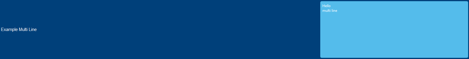
- add_link_2_show(option: Option | Category | FunctionButton | Hint, value: str) None
This function couples the visibility of an option to the value of the FloatBox object.
- Parameters
- optionOption, Category, FunctionButton, Hint
Option which visibility should be linked to the value of the FloatBox.
- valuestr
string on which the option should be shown
- Returns
- None
Examples
This function can be used to couple the FloatBox value to other options, hints, function buttons or categories. In the example below, ‘option linked’ will be shown if the float value is below 0.1 or above 0.9.
>>> option.add_link_2_show(option=option_linked, value="")
- check_linked_value(value: str, value_if_hidden: Optional[bool] = None) bool
This function checks if the linked “option” should be shown.
- Parameters
- valuestr
string on which the option should be shown
- value_if_hidden: bool | None
the return value, if the option is hidden
- Returns
- bool
True if the linked “option” should be shown
- create_function_2_check_linked_value(value: str, value_if_hidden: bool | None = None) Callable[[], bool]
creates from values a function to check linked values
- Parameters
- valuestr
string on which the option should be shown
- value_if_hidden: bool | None
the return value, if the option is hidden
- Returns
- function
- create_widget(frame: QFrame, layout_parent: QLayout, row: Optional[int] = None, column: Optional[int] = None) None
This functions creates the FloatBox widget in the frame.
- Parameters
- frameQtW.QFrame
The frame object in which the widget should be created
- layout_parentQtW.QLayout
The parent layout of the current widget
- rowint | None
The index of the row in which the widget should be created (only needed when there is a grid layout)
- columnint | None
The index of the column in which the widget should be created (only needed when there is a grid layout)
- Returns
- None
- get_value() str
This function gets the value of the TextBox.
- Returns
- str
Value of the TextBox
- set_value(value: str) None
This function sets the value of the TextBox.
- Parameters
- valuestr
Value to which the TextBox should be set.
- Returns
- None
- class ScenarioGUI.gui_classes.gui_structure_classes.ValueHint(hint: str | list[str], category: Category, default_value: float = 0.0, warning: bool = False)
Bases:
HintThis class contains all the functionalities of the Hint option in the GUI. Hints can be used to show text (for information or warnings) inside the category.
- Parameters
- hintList[str]
Text of the hint with a before text value and after text value split by ,
- categoryCategory
Category in which the Hint should be placed
- warningbool
True if the Hint should be shown
Examples
>>> hint_example = ValueHint(hint="This is the temperature: , °C",  # or self.translations.hint_example if hint_example is in Translation class
>>>                     category=category_example,
>>>                     warning=True)
Gives:
- create_widget(frame: QFrame, layout_parent: QLayout, row: Optional[int] = None, column: Optional[int] = None) None
This functions creates the ButtonBox widget in the frame.
- Parameters
- frameQtW.QFrame
The frame object in which the widget should be created
- layout_parentQtW.QLayout
The parent layout of the current widget
- rowint
The index of the row in which the widget should be created (only needed when there is a grid layout)
- columnint
The index of the column in which the widget should be created (only needed when there is a grid layout)
- Returns
- None
- hide() None
This function makes the Hint invisible.
- Returns
- None
This function returns a boolean value related to whether or not the Hint is hidden.
- Returns
- Bool
True if the option is hidden
- set_font_size(size: int) None
set the text size of hint
- Parameters
- size: int
new font size as points
- Returns
- ——-
- set_text(name: str)
This function sets the text of the Hint.
- Parameters
- namestr
Text of the Hint
- Returns
- None
- set_text_value(value: float | str) None
This function sets the text of the ResultText. This text is the combination of the prefix, the data (converted to string) and a suffix.
- Parameters
- value: float | str
value should be included into labels
- Returns
- None
- show() None
This function makes the current Hint visible.
- Returns
- None